2 Data Summaries and Presentation

“Numerical quantities focus on expected values, graphical summaries on unexpected values.”

— John Tukey

Learning objectives
  1. Define data and categorize and identify different types of data
  2. Understand and calculate numerical summaries of different data types
  3. Learn about different types of graphs and how they can be interpreted

2.1 Introduction to Data

Data can be virtually anything that is observed and recorded, including how tall you are, the color of all the cars in a town, or the time it takes to drive to work. Just as the different types of data can vary considerably, so can the amount. There is a natural tension between the quantity of data available and our abilities to make sense of it. It is difficult to sort through large streams of data and make any meaningful conclusions. Instead, we can better understand data by condensing it into human readable mediums through the use of data summaries, often displayed in the forms of tables and figures. However, in doing so, information is often be lost in the process. A good data summary will seek to strike a balance between clarity and completeness of information. The focus of this chapter will be on descriptive statistics, utilizing both numerical and graphical summaries of various types of data.

The optimal summary and presentation of data depends on the data’s type. There are two broad types of data that we may see in the wild, which we will call categorical data and continuous data. As the name suggests, categorical data (sometimes called qualitative or discrete data) are data that fall into distinct categories. Categorical data can further be classified into two distinct types:

  • Nominal data: data that exists without any sort of natural or apparent ordering, e.g., colors (red, green, blue), gender (male, female), and type of motor vehicle (car, truck, SUV).
  • Ordinal data: data that does have a natural ordering, e.g., education (high school, some college, college) and injury severity (low, medium, high)

Continuous data (sometimes called quantitative data) can also be further categorized into two distinct types:

  • Interval data: data in which the scale is defined in terms of differences between observations; zero point is arbitrary. This includes, for examples, data such as temperature measured in Celsius or measures of intelligence (IQ).
  • Ratio data: data in which scale differences represent real relationships in the items measured; zero is not arbitrary. Examples of this include height, weight, income, or cytokine levels

A helpful way to classify these is to ask the question: “does it make sense to say that one measurement is twice as large as another?”. 50 inches is twice as large as 25 inches, but 50 degrees Fahrenheit is not twice as warm as 25 degrees Fahrenheit.

Categorical and continuous data are summarized differently, and we’ll explore a number of ways to summarize both types of data.


Definition 2.1


Categorical data: Data that takes on a distinct value (i.e., falls into categories)

Nominal data: A type of categorical data where the categories do not have any apparent ordering

Ordinal data: A type of categorical data where there is a natural ordering

Continuous data: Data that takes on numeric values, often measured on an interval

Interval data: Data in which scale is defined in terms of differences between observations; zero is arbitrary

Ratio data: Data in which scale refers to real relationships between observations; zero is not arbitrary

2.2 Categorical Data

2.2.1 Basic Categorical Summaries

Let’s begin by considering a dataset of survey responses for 592 students responding with their sex, hair color, and eye color. This data includes responses from male and female students, with hair colors that are black, brown, red, or blond, and eyes that are brown, blue, hazel, or green. Note that these are qualitative measures, suggesting that are dealing with categorical data. Let’s take a look at the data for the first ten subjects.

SubjectID Sex Hair Eye
1 Male Brown Blue
2 Female Blond Blue
3 Female Blond Blue
4 Female Black Brown
5 Male Red Green
6 Male Blond Blue
7 Female Black Brown
8 Male Blond Green
9 Female Blond Blue
10 Female Brown Brown

Each row indicates a subject possessing the indicated sex, hair, and eye color. For example, the first row indicates a male with brown hair and blue eyes. Trying to make sense of 592 such observations is a daunting task, so we can begin by taking the data we have and summarizing it in a useful way. For categorical data, like we have here, summarizing the data is pretty straightforward – you just count how many times each category occurs. For example, we can count how many of each hair color was observed in our data.

Black Brown Red Blond Total
108 286 71 127 592

This kind of counting is known as absolute frequency, which gives us a single value indicating the total number of observations. In looking at the table above, it is clear that there are far more observations with brown hair than black, blond, and red.

However, suppose somebody asks you how common brown hair is relative to other colors. Does it make sense to respond, “Oh, there are 286 individuals with brown hair?” Without knowing the values for the other hair colors, this number alone doesn’t carry much meaning. Is 286 observations a lot? It depends. Were 300 people examined? 3,000? Without knowing anything about the rest of the data, the absolute frequency may not be very useful.

In addition to actual counts of observations in categorical data, we may often be interested in proportions. A proportion can be as simple as taking the total number of a single category observed, and stating it in terms of the total number of observations. For example, instead of saying, “286 subjects who were observed had brown hair,” we might instead say, “286 of 592 subjects surveyed had brown hair.” Proportions are also sometimes known as relative frequencies, because they are relative to a specific number of observations. More commonly, we use percentages, a special type of proportions – where the quantity is considered per 100 observations. That is, 286 of 592 subjects becomes \(286/592 = 0.4831 = 48.31\%\). Let’s consider again the same table as above, this time in terms of percentages:

Black Brown Red Blond
18.2% 48.3% 12.0% 21.5%

By considering all observations as proportion per one hundred, we can quickly compare the relative counts of our observations. For example, we can quickly note that about half of the observations collected had brown hair, and almost twice as many had blond hair compared to red.

In addition to tables, we can also summarize categorical data visually. The most common figure used to represent categorical data is the bar plot. Below is a demonstration of a bar plot for the percentages of hair color in our data.

2.2.2 Advanced Categorical Summaries

Numerical and visual summaries become even more useful as our data becomes more complicated. Let’s continue with the data we’ve been using, but now let us also break down observations with each hair color by sex as well. This process is known as stratification.

Black Brown Red Blond Total
Male 56 143 34 46 279
Female 52 143 37 81 313
Total 108 286 71 127 592

First, we notice that by taking sums across the columns, we arrive at the same numbers that we had when only hair color was considered. If we sum horizontally across the rows, we also get the total number of observations of each sex. Note that the sum of both marginal totals add up to 592, the total number of observations. In other words, when stratifying the hair color counts by sex, we haven’t lost any information related to the hair color, but we have added information to our summary about sex.

Getting stratified counts is straightforward; however, we now have several ways in which we might compute the percentages. For the table above, there are three ways we could compute percents.

  • How many in each category, relative to the entire sample
Table 2.1: Relative to population
Male Female
Black 9.5% 8.8%
Brown 24.2% 24.2%
Red 5.7% 6.2%
Blond 7.8% 13.7%

Here, the percentages are computed by diving the count in each inner cell by the total sample size, 592. For example, there were 56 male respondents with black hair, representing 9.5% of the sample. Adding up all of the percentages gives us \(\approx\) 100% (due to rounding to the first decimal place we actually get 100.1% here).

  • How many of each hair color, within sex
Table 2.2: Proportion of hair color, by sex
Male Female
Black 20.1% 16.6%
Brown 51.3% 45.7%
Red 12.2% 11.8%
Blond 16.5% 25.9%
Total 100.0% 100.0%

Now our table looks very different. The percentages in the inner cells to not add up to 100%. Instead, the percentages have been computed relative to the total number of respondents in each sex. For example, we still have 56 male subjects with black hair, but relative to the total number of male subjects (279), this is 56/279 = 0.201 = 20.1%. There are 52 black-haired female respondents out of 313 total females, which gives us 53/313 = 0.166 = 16.6%. Since the percentages are computed relative to sex, we now see the percentages in each column add up to 100%. In other words, we have information about distribution of hair colors within sex.

  • How many in each sex, within hair color
Table 2.3: Proportion of sex, by hair color
Male Female Total
Black 51.9% 48.1% 100.0%
Brown 50.0% 50.0% 100.0%
Red 47.9% 52.1% 100.0%
Blond 36.2% 63.8% 100.0%

Similarly, we can also look at the relative frequencies of each sex within the four hair color categories. We have 56 black-haired males and 52 black-haired females, so 56/108 = 0.519 = 51.9% of the black-haired respondents are male and 53/108 = 0.481 = 48.1% are female. Since hair color is given in the rows of our table, we now have percentages that add up to 100% in each row.

All three of these tables are correct and informative. When deciding the best way to calculate percentages for tables like this, it will depend on the research question and the data at hand. We can also use stratification graphically, by creating multiple bar plots for each category of the stratification variable.


Definition 2.2


Absolute frequency: The number of observations in a category

Proportion/Relative frequency: A proportion is a number or quantity relative to a whole. That is, both the part and the whole are of the same basic unit, i.e., hair color.

Percent: A percentage represents a special proportion, when the whole is standardized to be 100.

Ratio: A ratio is a comparison of relative size between two values; it is commonly expressed with a colon.

Rate: When one quantity is divided by another, often (but not necessarily) with different units. A proportion is a type of rate in which the units are the same, though a rate such as “miles per hour” would not be a proportion.

Bar plot: Visualization of categorical data which uses bars to represent each category, with counts or percents represented by the height of each bar

Stratification: The process of partitioning data into categories prior to summarizing

2.3 Continuous Data

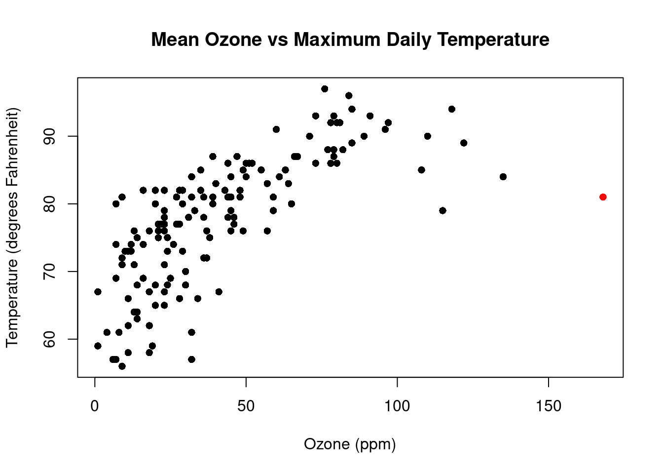
To explore graphical and numerical summaries of continuous data, let’s consider a dataset which contains daily air quality measurements in New York from May to September 1973. Let’s look at the first 10 rows of the data:

Month Day Temp Wind Ozone
5 1 67 7.4 41
5 2 72 8.0 36
5 3 74 12.6 12
5 4 62 11.5 18
5 5 56 14.3 9
5 6 66 14.9 28
5 7 65 8.6 23
5 8 59 13.8 19
5 9 61 20.1 8
5 10 69 8.6 25

This data contains continuous measurements on the air quality:

  • maximum daily temperature in degrees Fahrenheit at La Guardia Airport (Temp)
  • average wind speed in miles per hour (mph) at La Guardia Airport (Wind)
  • average ozone in parts per billion (ppb) from 1:00pm - 3:00pm at Roosevelt Island (Ozone)

The tables and bar charts we introduced in Section 2 are great summaries when the data can be categorized and counted. With continuous data, however, there are no natural discrete categories into which our data can be organized. Instead, one way we can visualize the data is by first creating bins which partition an interval of possible values and then counting the number of observations that fall into each bin. For example, when considering a range of temperature values from 50°F - 100°F, we might construct bins at intervals of 5°F. Plotting the absolute or relative frequency of observations in each bin gives us a histogram. Below is an example of a histogram representing the maximum daily temperatures from our New York data:

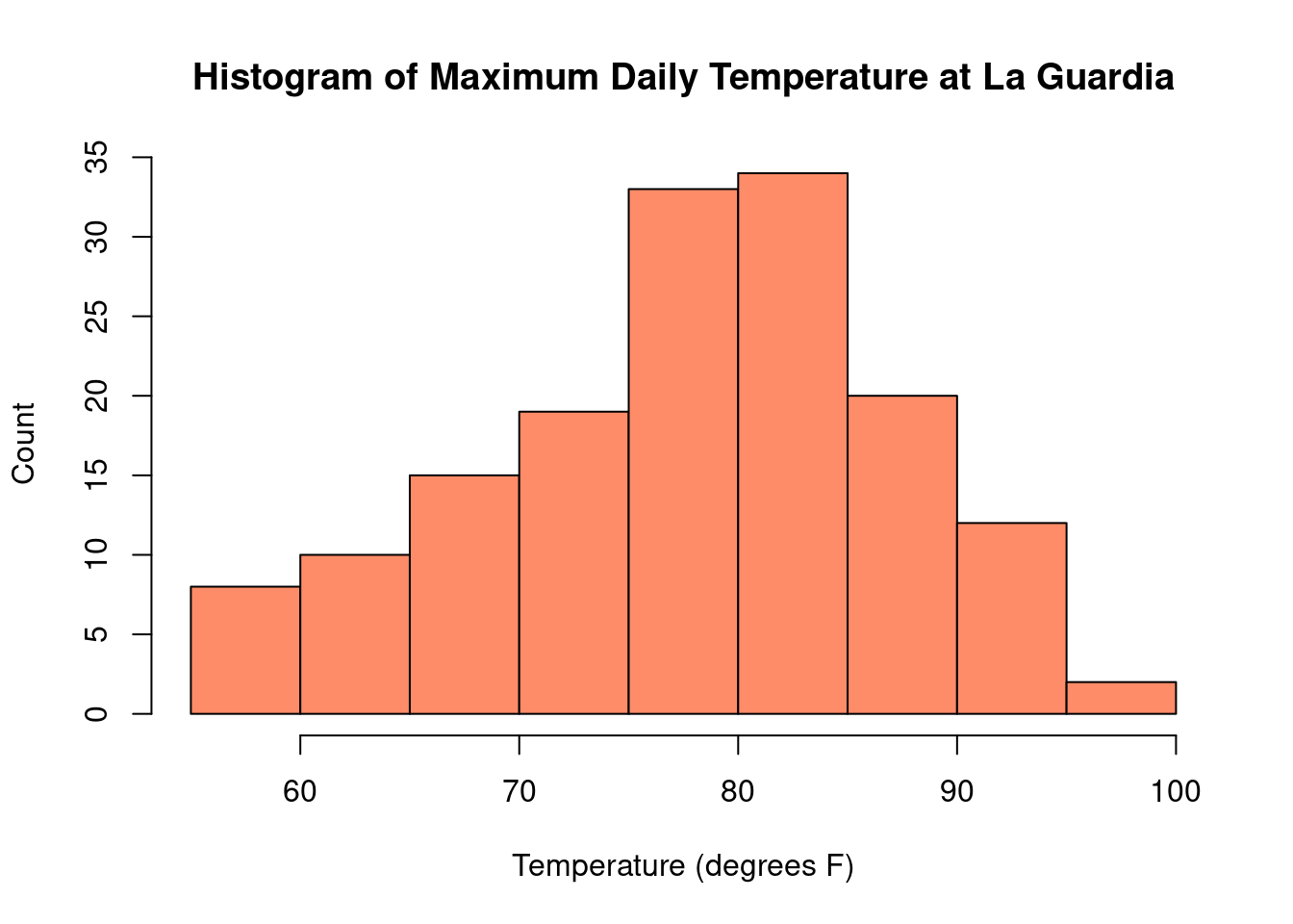
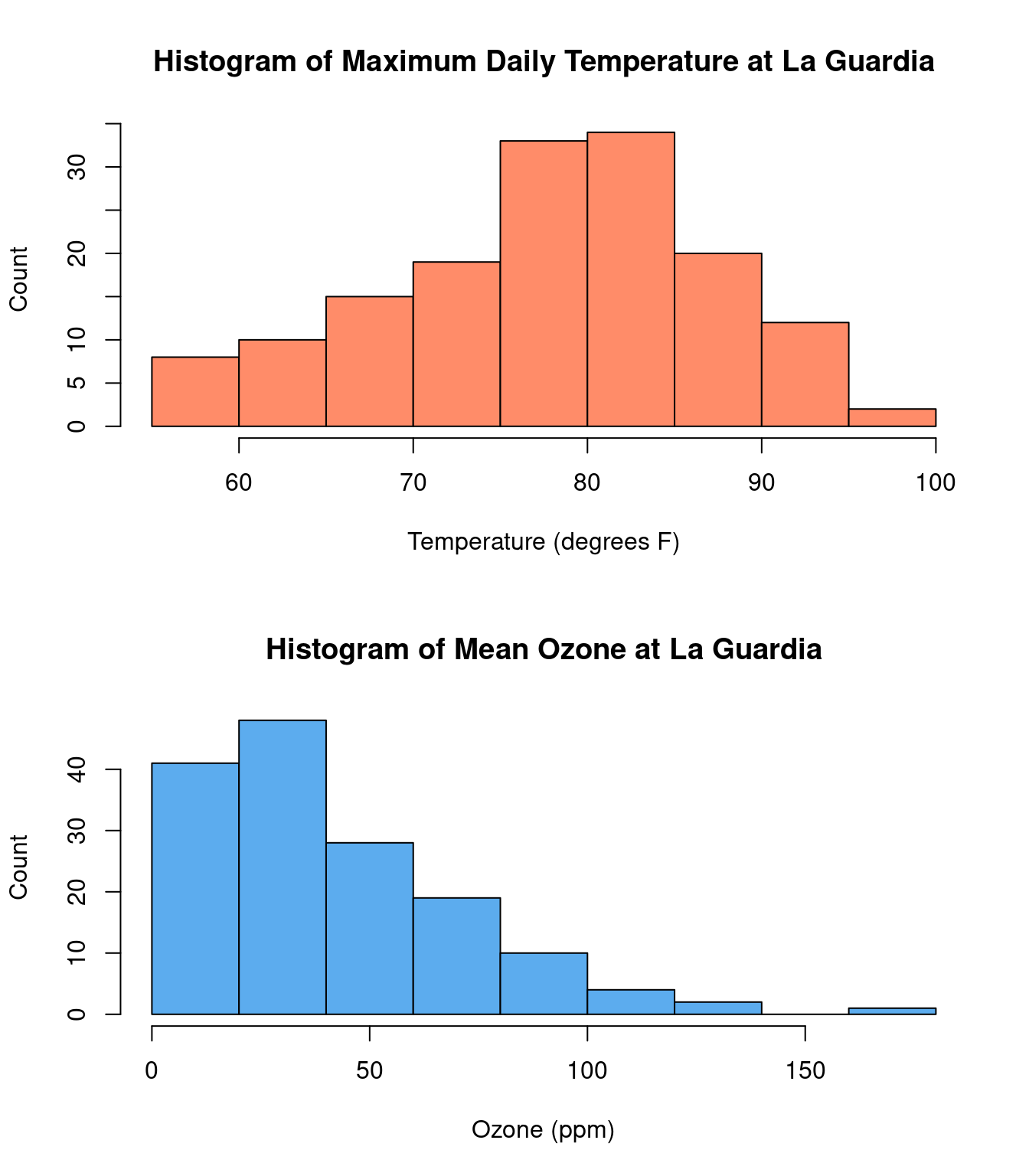
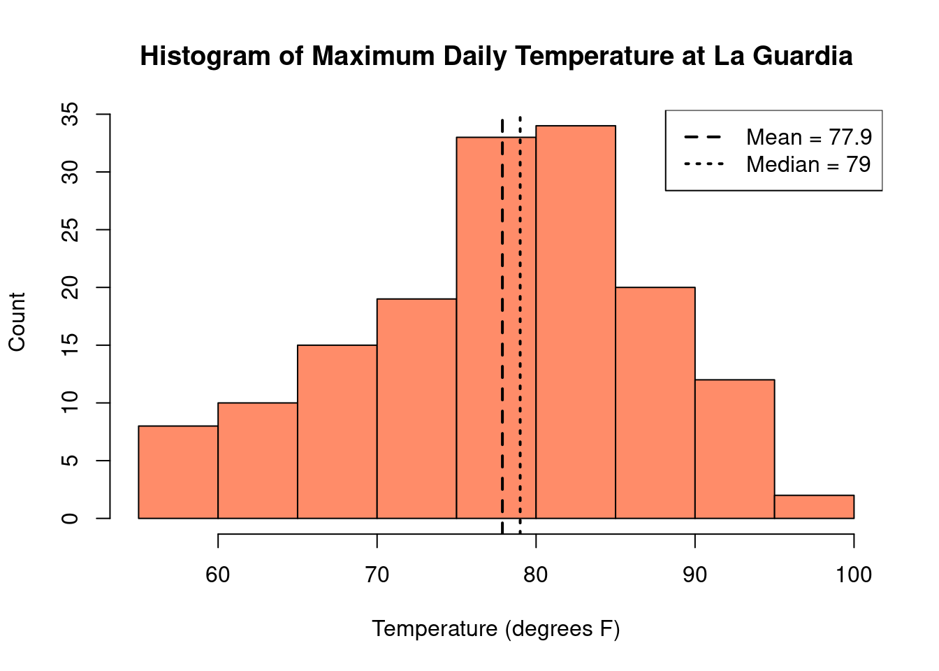
In the histogram of temperature, we can readily see that on most days between May and September, the maximum temperature at La Guardia was between 75°F - 85°F. Some days were particularly chilly, with temperatures below 60°F and some days were quite hot, with temperatures above 90°F.

Histograms also provide a nice picture of the distribution, or “shape”, of the observed data. Distributions of data can look very different for different sets of data, and we will consider them in more detail in Chapter 6. For now, its only relevant to know that distributions of data are often summarized with two types of measures – those that describe where the centers (peaks) of our data are and those that describe how spread out the data is about that peak. As these will be important concepts for the rest of this book, let’s take a moment now to go into a bit more detail into each.

2.3.1 Measures of Centrality

While nothing can replace a picture, sometimes it is preferable to summarize our data with one or two numbers characterizing the most important information about the distribution. Often, we are most interested in information that describes the ‘center’ of a distribution, where the bulk of our data tends to aggregate. The two most common ways to describe the center are with the mean and the median.

The mean is the most commonly used measure of the center of a distribution. Simply enough, the mean is found by taking the sum of all of the observations, and dividing by the total. With \(n\) observations, \(x_1, x_2, ..., x_n\), we can mathematically express the mean, denoted as \(\bar{x}\) (x-bar), in the following way:

\[ \bar{x} = \frac{x_1 + x_2 + \dots + x_n}{n} = \frac1n \sum_{i=1}^n x_i \] The median is another common measure of the center of a distribution. In particular, for a set of observations, the median is an observed value that is both larger than half of the observations, as well as smaller than half of the observations. In other words, if we were to line our data up from smallest to largest, the median value would be right in the middle. Indeed, to find the median, we begin by arranging our data from smallest to largest. If the total number of observations, \(n\), is odd, then the median is simply the middle observation; if \(n\) is even, it is the average of the middle two.

Examples:

  • \(1, 2, 2, 3, {\color{red} 5}, 7, 9, 10, 11 \quad \Rightarrow \quad \text{Median} = 5\)
  • \(1,2,2,3, {\color{red} 5}, {\color{red} 6}, 7, 9, 10, 11, \quad \Rightarrow \quad \text{Median} = \frac{(5+6)}{2} = 5.5\)

For the New York temperature data, the mean is 77.9°F and the median is 79°F. These values are very similar to each other, and both fall near the peak in the histogram.

However, it is not always the case that the mean and median will be similar. Let’s consider an example in Table 2.4 where we collect \(n = 10\) samples of salaries for University of Iowa employees:

Table 2.4: University of Iowa Salaries
$31,176 $130,000
$50,879 $37,876
$34,619 $144,600
$103,000 $48,962
$36,549 $5,075,000

For our sample, we find that the mean is $569,266, but the median is ($48,962 + $50,879) / 2 = $49,921. It turns out our sample included the highest paid university employee – the head football coach. This extremely high salary has caused the mean to be very large – larger than the remaining 90% of the salaries in our sample combined. The median, on the other hand, ignoring the extremes ends of our distribution and focusing on the middle, is not impacted by the football coach’s salary. Consequently, in this case, it is a much better reflection of the typically university employee’s salary than the estimate found with the mean.

This one high salary, which is not representative of most of the salaries collected, is known as an outlier. From the example above, we have seen that the mean is highly sensitive to the presence of outliers while the median is not. Measures that are less sensitive to outliers are called robust measures. The median is a robust estimator of the center of the data.

We have seen an example where the mean and median are quite close and an example where they are wildly different. This begs the broader question – when might we expect these measures of central tendency to be the same, and when might we expect 
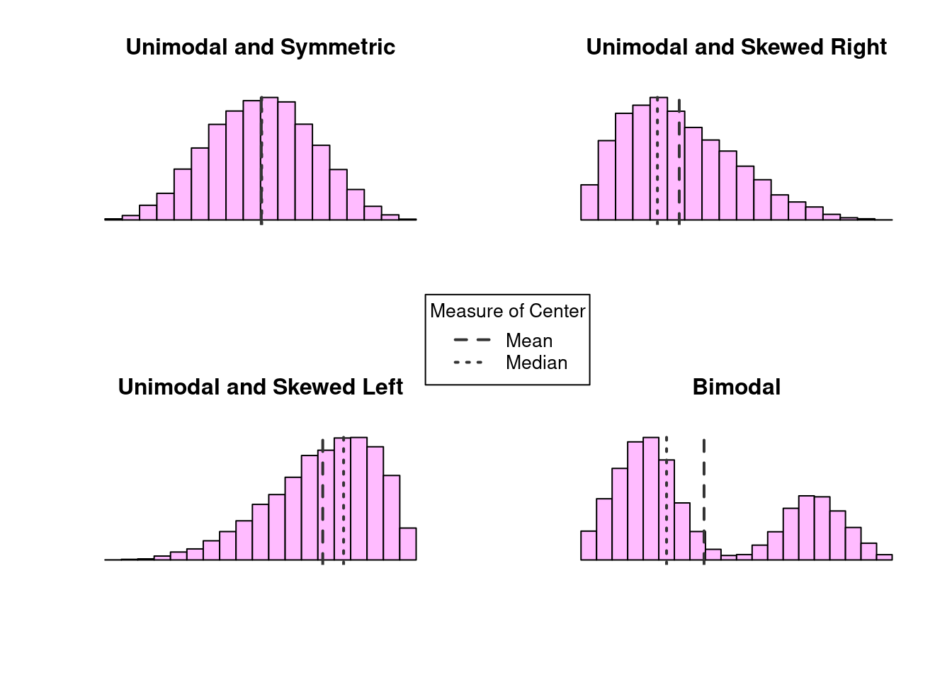
them to differ? Here, we consider a collection of histograms showing us different “shapes” that the distributions of our data may take.

Examples of modality and skew

Figure 2.1: Examples of modality and skew

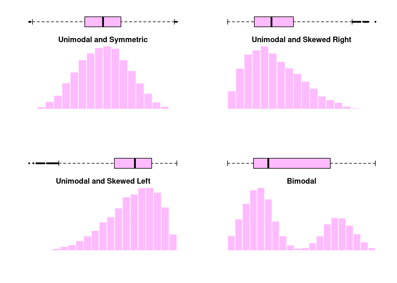
The shape of a distribution is often characterized by its modality and its skew. The modality of a distribution is a statement about its modes, or “peaks”. Distributions with a single peak are called unimodal, whereas distributions with two peaks are call bimodal. Multimodal distributions are those with three or more peaks. The skew on the other hand describes how our data relates to those peaks. Distributions in which the data is dispersed evenly on either side of a peak are called symmetric distributions; otherwise, the distribution is considered skewed. The direction of the skew is towards the side in which the tail is longest. Examples of modality and skew are presented in Figure 2.1.

When the data is unimodal and symmetric, the mean and median are indistinguishable. However, when there is skew or multiple peaks, we see the mean and median start to differ. When the distribution is skewed, the mean is pulled towards the tail. On the other hand, the number of very large/small observations is relatively small, so the median remains closer to the peak where the majority of data lies. When the distribution is bimodal, neither the mean or median can summarize the distribution well. In that case, it might be better to characterize the center of each peak individually.


Definition 2.3


Mean: The average value, denoted \(\bar{x}\) and computed as the sum of the observations divided by the number of obervations

Median: The middle value or 50th percentile, the value such that half the observations lie below it and half above

Outlier: Extreme observations that fall far away from the rest of the data

Robust: Measures that are not sensitive to outliers

Unimodal: Characterization of a distribution with one peak

Bimodal: Characterization of a distribution with two peaks

Multimodal: Characterization of a distribution with three or more peaks

Symmetric: Characterization of a distribution with equal tails on both sides of the peak

Skewed right: Characterization of a distribution with a large tail to the right of the peak

Skewed left: Characterization of a distribution with a large tail to the left of the peak

2.3.2 Measures of Dispersion

In addition to measuring the center of the distribution, we are also interested in the spread or dispersion of the data. Two distributions could have the same mean or median without necessarily having the same shape. For example, consider the two distributions of data shown below. Each distribution represents a sample of 1,000 observations with mean of 100.

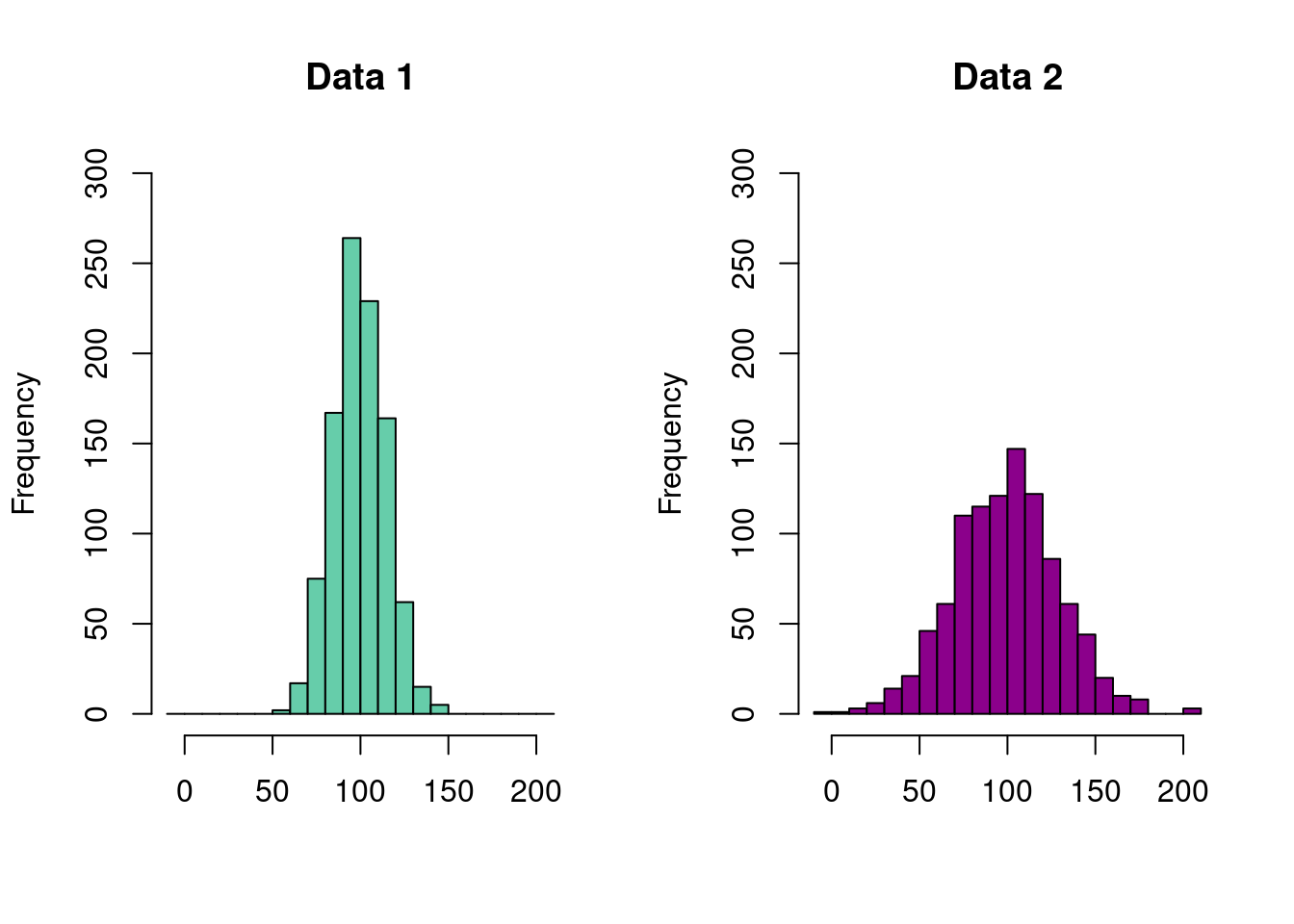
Despite the mean values of each of these distributions being the same, we can clearly see that they are different. On the left, we see that nearly the entire range of the observed data falls between 50 and 150. For the distribution on the right, the data is much more spread out, taking on values near 0 and 200. In order to accurately capture these differences, we need a second numerical summary describing the degree to which the data is spread about its center. Here, we consider two broad categories – those based on percentiles and those based on the variance.

2.3.2.1 Percentiles and IQR

Perhaps the most intuitive methods of describing the dispersion of our data are those associated with percentile-based summaries. Formally, the \(p\)th percentile is some value \(V_p\) such that

  1. \(p\%\) of observations are less than or equal to \(V_p\)
  2. \((100 - p)\%\) of observations are greater than or equal to \(V_p\)

Informally, percentiles quantify where observations fall, relative to all of the other observations in the data. Two of the best known percentiles are the \(1^{st}\) and \(99^{th}\) percentiles, more commonly referred to as the minimum and maximum values. Together, these two numbers describe the range of our data. The next most common value is the \(50^{th}\) percentile – the median – which we recall describes the value for which half of our observations and greater (or lesser) than. We are also often interested in determining the \(25^{th}\) and \(75^{th}\) as well, which, respectively, mark the midpoints between the minimum and the median and the median and the maximum. Along with the median, these three percentiles make up the quartiles of our data, denoted

\[ \begin{align*} Q_1 &= 25^{th} \text{ percentile} = 1^{st} \text{ or lower quartile} \\ Q_2 &= 50^{th} \text{ percentile} = 2^{nd} \text{quartile or median} \\ Q_3 &= 75^{th} \text{ percentile} = 3^{rd} \text{ or upper quartile} \end{align*} \] We know the median, \(M\), is the value such that 50% of observations are less than the median and 50% are greater than it. \(Q_1\) can be said to represent the median of the smaller 50% of all observations, while \(Q_3\) can be said to be the median of larger 50%. In other words, 25% of the data is below \(Q_1\), 25% of the data is between \(Q_1\) and \(M\), 25% of the data is between \(M\) and \(Q_3\), and the remaining 25% of the data is larger than \(Q_3\).

A commonly used percentile-based measure of spread combining these measures is the interquartile range (IQR), defined as

\[\text{IRQ} = Q_3 - Q_1.\]

Because it is the difference between the upper and lower quartile, it represents the distance covering the middle 50% of the data. We may also report the range 
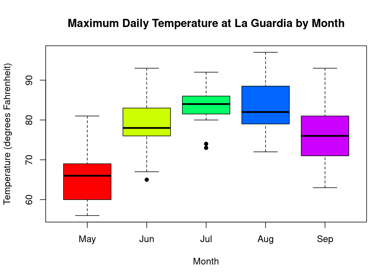
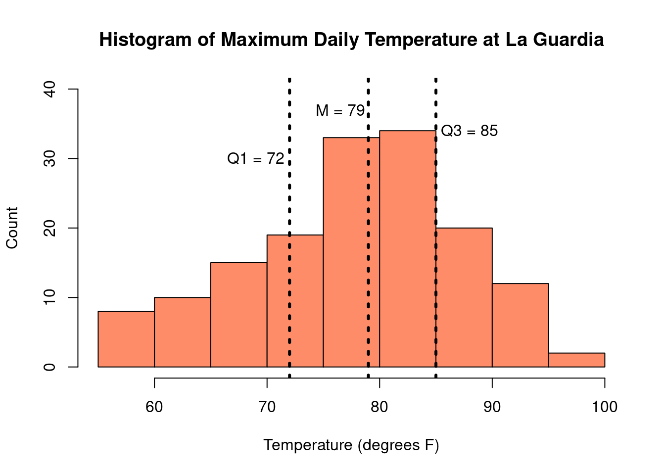
as an interval as \((Q_1, Q_3)\). For the New York temperature data, \(Q_1 = 72\), \(Q_3 = 85\). The IQR is therefore \(85 - 72 = 13\) and tells us that 50% of the days between May and September had temperatures between 72°F and 85°F.

The IQR is not impacted by the presence of outliers, so it is considered a robust measure of the spread of the data. So, like the median, it enjoys the quality of being a robust measure of the data.

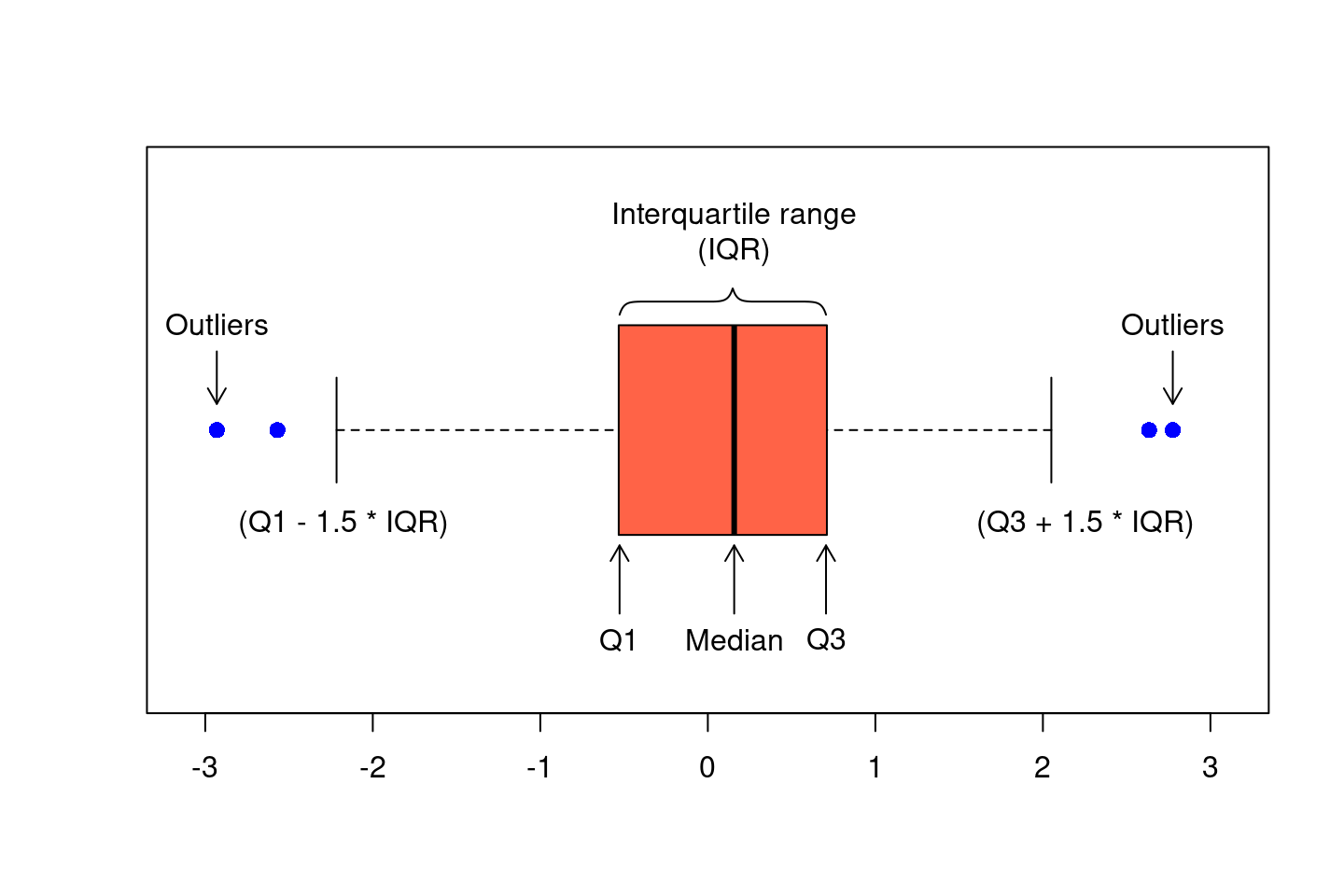
Percentiles are also used to create another common visual representation of continuous data: the boxplot, also known as a box-and-whisker plot. A boxplot consist of the following elements:

  • A box, indicating the Interquartile Range (IQR), bounded by the values \(Q_1\) and \(Q_3\)
  • The median, or \(Q_2\), represented by the line drawn within the box
  • The “whiskers”, extending out of the box, which can be defined in a number of ways. Commonly, the whiskers are 1.5 times the length of the IQR from either \(Q_1\) or \(Q_3\)
  • Outliers, presented as small circles or dots, and are values in the data that are not present within the bounds set by either the box or whiskers

Just like histograms, boxplots can also illustrate the skew of a data. In a histogram, the skewed was named after the location of the tail and in a boxplot, this corresponds to the side with a longer whisker. Here we can see histograms and boxplots for various distributions of data.


Definition 2.4


Percentile: A value, \(V_p\) such that \(p\)% of observations are smaller than \(V_p\) and \(1-p\)% of observations are larger than \(V_p\)

Range: The distance between the minimum and maximum values in a dataset

Interquartile range (IQR): The middle 50% of the data, the difference between the upper and lower quartiles

Boxplot/box-and-whisker plot: Visualization of continuous data which is based on percentiles

2.3.2.2 Variance and Standard Deviation

The variance and the standard deviation are numerical summaries which quantify how spread out the distribution is around its mean. This is done by calculating how far away each observation is from the mean, squaring that difference, and then taking an average over all observations. For a sample of \(n\) observations \(x_1, x_2, ..., x_n\), the variance, denoted by \(s^2\), is calculated as:

\[ s^2 = \frac{1}{n-1} \sum_{i=1}^n (x_i - \bar{x})^2. \]

The standard deviation, denoted \(s\), is a function of the variance. Specifically, it is the square root of the variance \(s = \sqrt{s^2}\). Because the variance uses the squared differences between each observation and the mean, its units are the square of the units of the original data. For example, the New York temperature measurements have a mean of 77.9°F and a variance of 89.6°F2, a value that does not readily lend itself to interpretation. The standard deviation, on the other hand, takes the square root, putting the units back on the original scale. For the temperature data, the standard deviation is 9.5°F. Because of this, the standard deviation is often preferred as a measure of spread over the variance.

Finally, unlike the median and the IQR, which are based the percentiles of the observed data, both the variance and standard deviation are calculated based on the mean. Recall that the mean is not a robust outlier and is highly sensitive to skew or the presence of outliers. Consequently, the variance and the standard deviation are also very sensitive. When the data are unimodal and symmetric, choosing between the mean/standard deviation and the median/IQR is largely a matter of preference. However, when the data is skewed or has large outliers, more robust statistics such as the median and IQR are preferred.

Exercise 2.1

Exercises

The applet below is designed to help illustrate the properties of the mean and standard deviation. You can vary the mean between -10 and 10 and the standard deviation between 1 and 20. The histogram on the right displays the unimodal and symmetric distribution of data with the specified mean and standard deviation.

  1. Set the standard deviation to 8 and use the slider to vary the mean of the distribution. What properties of the histogram change as the mean is varied? What stays the same?
  2. Now, set the mean to 0 and vary the standard deviation. What properties of the histogram change as the standard deviation is varied? What stays the same?
  3. Let’s examine more closely how the standard deviation affects the distribution of data. Keep the mean at 0, and set the standard deviation to 4, 8, 12, 16, and 20.
    1. For each standard deviation, fill out the following table with the approximate minimum and maximum values of the data.
    2. Standard deviation Minimum and maximum
      4
      8
      12
      16
      20
    3. What do you notice about the relationship between the standard deviation and the minimum/maximum values observed in the data? Is there any noticeable pattern in your table?

Definition 2.5


Variance: The average of the squared differences between each data value and the mean, denoted \(s^2\)

Standard deviation: The square root of the variance, denoted \(s\)

Percentile: Summaries providing the location of observations relative to all other observations in the data

2.4 Advanced Data Visualizations

As we saw in the last section, histograms and boxplots are useful when describing the distribution of one continuous measurement. What if we have both categorical and continuous measurements or multiple continuous measurements? Let’s return to the New York air quality data:

Month Day Temp Wind Ozone
5 1 67 7.4 41
5 2 72 8.0 36
5 3 74 12.6 12
5 4 62 11.5 18
5 5 56 14.3 9
5 6 66 14.9 28
5 7 65 8.6 23
5 8 59 13.8 19
5 9 61 20.1 8
5 10 69 8.6 25

One thing we might be interested in is the distribution of temperatures in each month. Month can be considered an ordinal categorical variable, and temperature is continuous. When we want to see the distribution of a continuous variable across multiple categories, we can look at side-by-side boxplots.

By putting all of the boxplots next to each other with the same temperature range, we can quickly detect trends and differences in temperature in the five months. Median temperature peaks in July/August and is lowest in May. Temperatures in May and September are more variable, whereas the range of temperatures in July is less spread out. There is some overlap between all of these boxplots, which means that although July and August have higher temperatures more often, there are days in the other months that are just as hot or days in July that are cooler.

Now let’s consider the case in which we have two continuous variables. Suppose, for example, that we are interested in both temperature and ozone levels, as well as the relationship between the two of them. We might first consider them separately; presented below is a visualization of the distribution of both temperature and ozone levels in the New York air quality data:

While temperature is unimodal and symmetric in distribution, the ozone concentration measurements are skewed right. These plots are useful in studying each of these variables individually, but they do not provide any information about the relationship between temperature and ozone concentration, which we may expect to be related.

To look at the relationship between two continuous variables, a common visualization is the scatter plot. A scatter plot is a two-dimensional plot of data pairs, with one variable represented on the x-axis, the horizontal range of the plot, and the other variable on the y-axis, or the vertical range. Each dot on a scatter plot represents a single observation. In the plot below, we have put the mean ozone on the x-axis and temperature on the y-axis, with each dot representing one day between May and September. For example, on August 25th, the maximum temperature was 81°F, and the mean ozone concentration was 168ppm. For illustration, this day is colored red on the scatter plot.

Plotted together, the relationship between ozone concentration and temperature becomes apparent – lower temperatures tend to be associated with lower ozone concentrations while higher temperatures are associated with higher ozone levels. The scatter plot is able to illustrate an important relationship that wouldn’t be detectable just by looking at histograms of each variable separately.

We may further describe our data by including a third categorical variable. In our scatter plot of ozone and temperature, we could also color the points by the month on which they occurred.

After coloring the points by month, we can see some clusters forming as temperature and ozone concentration on days closer together are more likely to be similar. By adding information about a third variable, we are able to illustrate more information about our data in one figure.

Numerical summaries and graphical visualizations provide us with tools to
capture important features of our data. Understanding the distribution and skew of a variable help us know the best way to summarize it numerically. Summaries and figures can become increasingly complex as they incorporate more variables, but these illustrations can be informative for answering and producing important research questions and hypotheses.


Definition 2.6


Scatter plot: Visualization of two continuous measures which uses dots to represent each data pair